
Tron Burgundy
Jacksonville, FL
The Much Bigger Half of Halftone Def Studios - Levi Ratliff
The Much Larger Half of Halftone Def Studios - aka Levi Ratliff
- brewin sweet tea
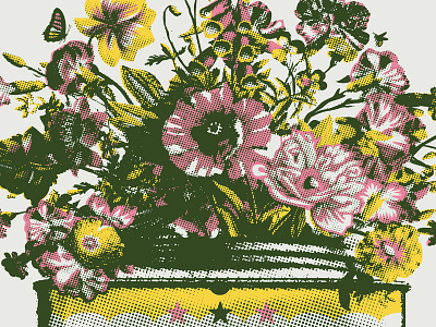
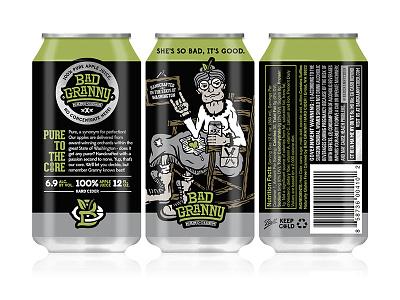
- illustration
- mechanic
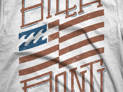
- screen printing
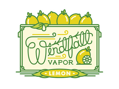
- typography
- yard sailin


Loading more…